Midnight metal
#161716 THE BRASS PIXELINDEPENDENT WEB DESIGNER
THE BRAND WORKSHOP / IDENTITY & COMPONENTS
A working guide to The Brass Pixel’s visual language: ornate craftsmanship, calm reading surfaces, and a controlled flash of blue.
01 / THE BRAND MARK
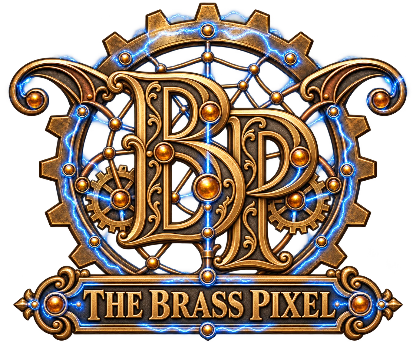
The engraved BP monogram and THE BRASS PIXEL nameplate share one identity. Brass clockwork, amber details, and blue electricity connect the logo to the website. The original supplied artwork is retained separately as an archive.
Keep the emblem proportional, give it generous space, and use it on dark surfaces. Never stretch, recolor, or place text over it. At small sizes, use the simple pixel favicon rather than expecting the engraving to remain legible.
Download logo02 / THE PALETTE
#161716#242523#e2b56e#d98b35#6ccaff#f4ead8Use dark metal for 80% of the surface, brass for emphasis, and blue sparingly for focus and active states. Amber is decorative, not body text.
03 / TYPOGRAPHY
Aa Bb Cc / 0123456789
Playfair Display for expressive headlines. DM Sans for navigation, body copy, and controls. Georgia and Arial provide offline fallbacks.
04 / CUSTOM ICONS
 designSVG ↓
 codeSVG ↓
 careSVG ↓
 compassSVG ↓
 sparkSVG ↓
 launchSVG ↓
 mobileSVG ↓
 accessSVG ↓
 arrowSVG ↓
 gridSVG ↓
Solid brass symbols in engraved gear medallions, with beveled highlights and electric-blue accents. Keep icons decorative when a text label already names the action.
05 / BUTTONS & INTERACTION
Brass marks the main action. Blue outlines show keyboard focus. Hover movement stays subtle and respects reduced-motion preferences.
06 / BORDERS, TILES & PAGE CARDS
Fine brass rules, clipped corners, and quiet rivet accents. A strong boundary without sacrificing space.
A restrained grid adds depth to supporting surfaces. Keep its contrast below the text and controls.
A small blue edge connects the interface to the source emblem. Reserve it for selected highlights.
The ornamental divider is a supporting flourish. Its text-free artwork can scale or crop without losing information.
07 / VOICE & HONESTY
Say what the website does and how the process works. Keep the craftsmanship language grounded in practical benefits. No invented clients, reviews, awards, response times, or performance claims.
Label concept work clearly. State when a form is local-only. Agree on scope and costs before starting paid services.